
GuideThe Power of Sanity: Creating a Color Design System to improve Editing Experience and Design Consistency
For great results in web design and content management, consistency is key. With the help of Sanity, an advanced content management system, you can significantly improve the editing experience for clients. Leveraging the power of Sanity, you can build polished design systems directly within the CMS. In this guide, we will walk you through the process of creating a color design system that not only enhances the editing experience but also ensures design consistency. Let's dive in!
The Result
In this section, we will outline what we are going to build and the goals we aim to achieve with our color design system. We'll also provide screenshots to give you a visual understanding of the final product.
What We Are Going to Build
We will create a color design system within Sanity that allows users to define one-off colors using Sanity's color input plugin. Additionally, users will be able to globally define design system colors that can be easily reused throughout the CMS.
Desired Outcomes
Flexibility with One-Off Colors: Users will have the ability to define custom colors for specific use cases, making the CMS more dynamic and adaptive to different content needs.
Global Design System Colors: We'll empower users to define a set of standardized colors that align with the brand's identity, promoting consistency across the entire website.
Efficient Data Structure:
For the purpose of this guide, we will use Gatsby as an example framework and focus on implementing the color design system specifically for Sanity v3. However, it should be fairly easy to adapt and implement the same principles with Sanity v2 as well.
Let's move on to the next steps and start building our Sanity-powered color design system!

Creating the Sanity Schema
To get started, we need to set up the Sanity schema and add the color input plugin. Here's how you can do it:
- First, add Sanity's color input plugin to your studio:
- Install the plugin using npm or yarn: npm i @sanity/color-input
- Import colorInput from the installed package in sanity.config.ts (or .js) and add it as a plugin:
import { colorInput } from '@sanity/color-input'

export default {
  // ...
  plugins: [colorInput()],
}
- Now, you can use the color type in your schema types. For example, when defining a new field, like favoriteColor, you can use the type color:
{
  // ...
  fields: [
	  // ...
	  { name: 'favoriteColor', title: 'Favorite color', type: 'color' },
  ]
}
By using the color type, you can easily define custom colors in your Sanity CMS. When you create a color, it will result in a data structure like the following:
{
  "_type": "color",
  "hex": "#29158a",
  "alpha": 0.9,
  "hsl": {
  	"_type": "hslaColor",
  	"h": 249.99999999999994,
  	"s": 0.7328000000000001,
  	"l": 0.313,
  	"a": 0.9
  },
  "hsv": {
  	"_type": "hsvaColor",
  	"h": 249.99999999999994,
  	"s": 0.8457987072945522,
  	"v": 0.5423664,
  	"a": 0.9
  },
  "rgb": {
  	"_type": "rgbaColor",
  	"r": 41,
  	"g": 21,
  	"b": 138,
  	"a": 0.9
  }
}
Next, let's create the required document type in the schema for the design system color. This type will reference the color input type provided by the Sanity plugin:
export default {
  name: 'designSystemColor',
  title: 'Design system color',
  type: 'document',
  fields: [
	  { title: 'Title', name: 'title', type: 'string' },
	  { title: 'Color', name: 'color', type: 'color' },
  ],
  preview: {
	select: {
  	title: 'title',
  	color: 'color',
	},
	prepare(selection) {
  	const { color, title } = selection

  	return {
    	title: title,
    	media: (
      	<span
        	style={{
          	border: 'solid',
          	borderWidth: '0.5px',
          	borderColor: 'white',
          	width: '2rem',
          	height: '2rem',
          	borderRadius: '100%',
          	backgroundColor: color.hex,
        	}}
      	/>
    	),
  	}
	},
  },
}
Don't forget to use the file extension .jsx to allow for the preview to return JSX.
Explanation of the Preview: The preview is responsible for displaying a visual representation of the design system color in the Sanity Studio. It utilizes the selected title and color fields to create a small colored circle as a preview. The media property in the prepare function defines the HTML representation of the color, displayed as a colored circle.
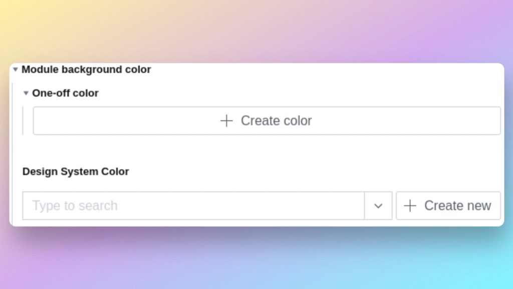
Adding Color Choice Options: To give users the ability to choose between a one-off color and picking a color from the existing design system colors, we'll add a new object to the schema called colorChoice. This object will have two fields: oneOffColor and designSystemColor.
import { IoColorFillOutline } from 'react-icons/io5'

export default {
  name: 'colorChoice',
  title: 'Color Choice',
  type: 'object',
  icon: IoColorFillOutline,
  options: {
	  collapsible: true,
	  collapsed: true,
  },
  fields: [
	{
  	type: 'color',
  	name: 'oneOffColor',
  	title: 'One-off color',
  	hidden: ({ parent, value }) => !value && !!parent?.designSystemColor,
	},
	{
  	type: 'reference',
  	name: 'designSystemColor',
  	to: { type: 'designSystemColor', title: 'Design system color' },
  	hidden: ({ parent, value }) => !value && !!parent?.oneOffColor,
	},
  ],
}
Explanation of the Schema: The colorChoice object provides two options for color selection: oneOffColor and designSystemColor. If the user selects a one-off color, they can define a custom color using the color input. On the other hand, if they choose a design system color, they can reference one of the colors defined in the designSystemColor document type we created earlier. We use the hidden property to conditionally hide one field when the other is being used, ensuring a more user-friendly experience.
Adapting the Sanity Desk Structure
In this section, we'll update the Sanity desk structure to include a menu for editors to manage design system colors. The provided example desk structure will serve as the base, and we'll incorporate the DesignSystemColorsMenu to achieve the desired functionality.
Let's go through the code and explanations.
Example Desk Structure Setup
We begin with the existing desk structure setup, which includes various menu items. The structure file looks like this:
import { ConfigMenuItem } from './config'
import { PageMenuItem } from './pages'
import { DesignSystemColorsMenu } from './designSystemColors'
import { LanguagesMenu } from './languages'
import { BlogsMenuItem } from './blogs'

export default (S) => {
  return S.list()
	.title('Content')
	.items([
  	PageMenuItem(S),
  	DesignSystemColorsMenu(S),
  	LanguagesMenu(S),
  	ConfigMenuItem(S),
  	BlogsMenuItem(S),
	])
}
Definition of DesignSystemColorsMenu
Now, we'll focus on the implementation of DesignSystemColorsMenu, which is a separate component responsible for handling the design system colors. Let's explore its code:
import React from "react"
import { HiOutlineColorSwatch } from "react-icons/hi"

const Icon = () => (
  <HiOutlineColorSwatch
  	style={{
    	fontSize: "2rem",
    	strokeWidth: "10px !important",
    	color: "#FFFFFFF",
  	}}
  	strokeWidth={1}
  />
)

export const DesignSystemColorsMenu = S => S.listItem()
  .title("Design System Colors")
  .id("designSystemColors")
  .icon(Icon)
  .child(
  	S.documentTypeList("designSystemColor")
    	.title("Design System Colors")
    	.menuItems(S.documentTypeList("designSystemColor").getMenuItems())
    	.filter("_type == $type")
    	.params({ type: "designSystemColor" })
    	.child(documentId =>
      	S.document().documentId(documentId).schemaType("designSystemColor")
    	)
  )
Explanation:
- We use the S.listItem() method to create a list item for the design system colors in the Sanity desk structure.
- The .title() method sets the title of the menu item as "Design System Colors".
- The .id() method assigns a unique ID "designSystemColors" to the menu item for identification purposes.
- The .icon() method allows us to set an icon for the menu item. In this example, we use the HiOutlineColorSwatch icon from the react-icons/hi library to represent color-related content.
- The .child() method is used to define the child elements within the menu item.
- We use S.documentTypeList() to create a list of documents for the "designSystemColor" schema type, displaying the list in the submenu.
- The .title() method sets the title of the submenu as "Design System Colors".
- The .menuItems() method populates the submenu with additional options, such as "Create New" and "Sort by Title".
- We apply a .filter() to the list to only show documents of the type "designSystemColor".
- Using .params(), we set the "type" parameter to "designSystemColor" to filter documents accordingly.
- The .child() method allows us to define the behavior when a specific design system color document is clicked. In this example, we navigate to the document editor for the chosen color using the S.document() method.
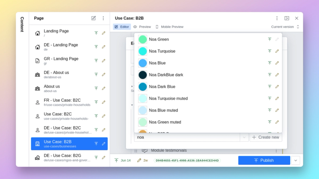
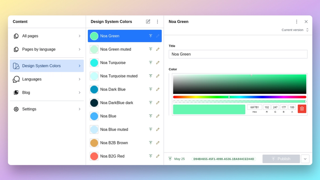
The Results in the Sanity Studio
With the implementation of the color design system in the Sanity Studio, editors now have a beautiful color selection interface that allows them to manage and define custom colors:

Next Step: Consuming Data in the Frontend
Now that we have set up the color design system and editors can easily manage colors in the Sanity Studio, the next step is to consume the created data in the frontend. Let's move on to the frontend implementation and see how we can achieve this!
Using the Selected Colors in the Frontend (Using Gatsby as an Example)
To showcase the usage of the selected colors in the frontend, we'll create a simple "hello-world" example: A Gatsby "HomePage" component that fetches data from the GraphQL layer (provided by gatsby-source-sanity) and utilizes the helper function getColorHex to get the related hex color.
Let's go through the steps.
Step 1: Create a Simple Example Gatsby HomePage Component
First, let's create the HomePage component that will display the headline using the selected color:
import React from "react"

const HomePage = ({ data }) => {
  const headlineData = data.sanityHomePage.headline
  const headlineColorHex = getColorHex(headlineData)

  return (
  	<div>
    	<h1 style={{ color: headlineColorHex }}>
    	  {headlineData.text}
    	</h1>
  	</div>
  )
}

export default HomePage
Step 2: Add a GraphQL Query to Fetch Data
In this step, we'll add a GraphQL query to fetch the necessary data from Sanity, including the color choices:
export const query = graphql`
  query {
  	sanityHomePage {
    	headline {
      	text
      	... on SanityColorChoice {
        	oneOffColor {
          	hex
        	}
        	designSystemColor {
          	color {
            	hex
          	}
        	}
      	}
    	}
  	}
  }
`
Step 3: Write a Helper Function to Get the Related Hex Color
To handle the color choices effectively, we need a helper function getColorHex that extracts the hex color value, regardless of whether it is a one-off color or a design system color.
export const getColorHex = (colorChoiceObject) => {
  // Check if the colorChoiceObject is defined
  if (!colorChoiceObject) return undefined

  // Extract the hex color based on the implementation
  // of colorChoice.js in Sanity
  const hex =
  	colorChoiceObject.oneOffColor?.hex ||
  	colorChoiceObject.designSystemColor?.color.hex

  return hex
}
Step 4: Adapt the Component to Use the Color
In this step, we import the helper function getColorHex and adapt the HomePage component to use the color hex in the h1 element's style.
import React from "react"
import { graphql } from "gatsby"
import { getColorHex } from "../path/to/colorUtils"

const HomePage = ({ data }) => {
  const headlineData = data.sanityHomePage.headline
  const headlineColorHex = getColorHex(headlineData)

  return (
  	<div>
    	<h1 style={{ color: headlineColorHex }}>
    	  {headlineData.text}
  	  </h1>
  	</div>
  )
}

export const query = graphql`
  query {
    sanityHomePage {
    	headline {
      	text
      	... on SanityColorChoice {
        	oneOffColor {
          	hex
        	}
        	designSystemColor {
          	color {
            	hex
          	}
        	}
      	}
    	}
    }
  }
`

export default HomePage
Now, the HomePage component will display the headline text with the color defined in the Sanity CMS. If the color is a one-off color, it will be applied, and if it is a design system color, the respective color will be used. This way, you can ensure that the selected colors are consistently applied to the frontend, providing a cohesive and visually appealing user experience.
Conclusion
Leveraging the flexibility of Sanity, we've created a powerful color design system that enhances the editing experience for content creators. This system allows editors to unleash their creativity and produce outstanding content effortlessly. By utilizing Sanity's capabilities, we've built a highly extendable and low-maintenance solution that benefits both developers and content editors/designers.
Advantages of the Color Design System:
- Consistency: Ensures design consistency across the entire website, reinforcing the brand identity.
- Efficiency: Simplifies the process of defining and managing colors, saving time and effort for content creators.
- Customization: Enables Editors to create one-off colors for unique content elements, offering greater flexibility in design.
- Reuse: Allows Editors to reuse predefined design system colors, promoting uniformity throughout the content.
- Smooth Frontend Integration: Seamlessly integrates with Gatsby (or other frontend frameworks) to apply selected colors across the website.
If you're interested in implementing a similar system or need Kasayo's support for any web development projects, please don't hesitate to reach out. We're here to assist you in creating exceptional digital experiences!